

Lune Nail Atelier Brochure
Print Design
A print system for a Toronto nail art studio a tri-fold brochure that pairs quiet editorial layout with close-up nail photography, so the work stays the focus and the pricing stays easy to read.
Print and collateral
Discipline
Deliverables
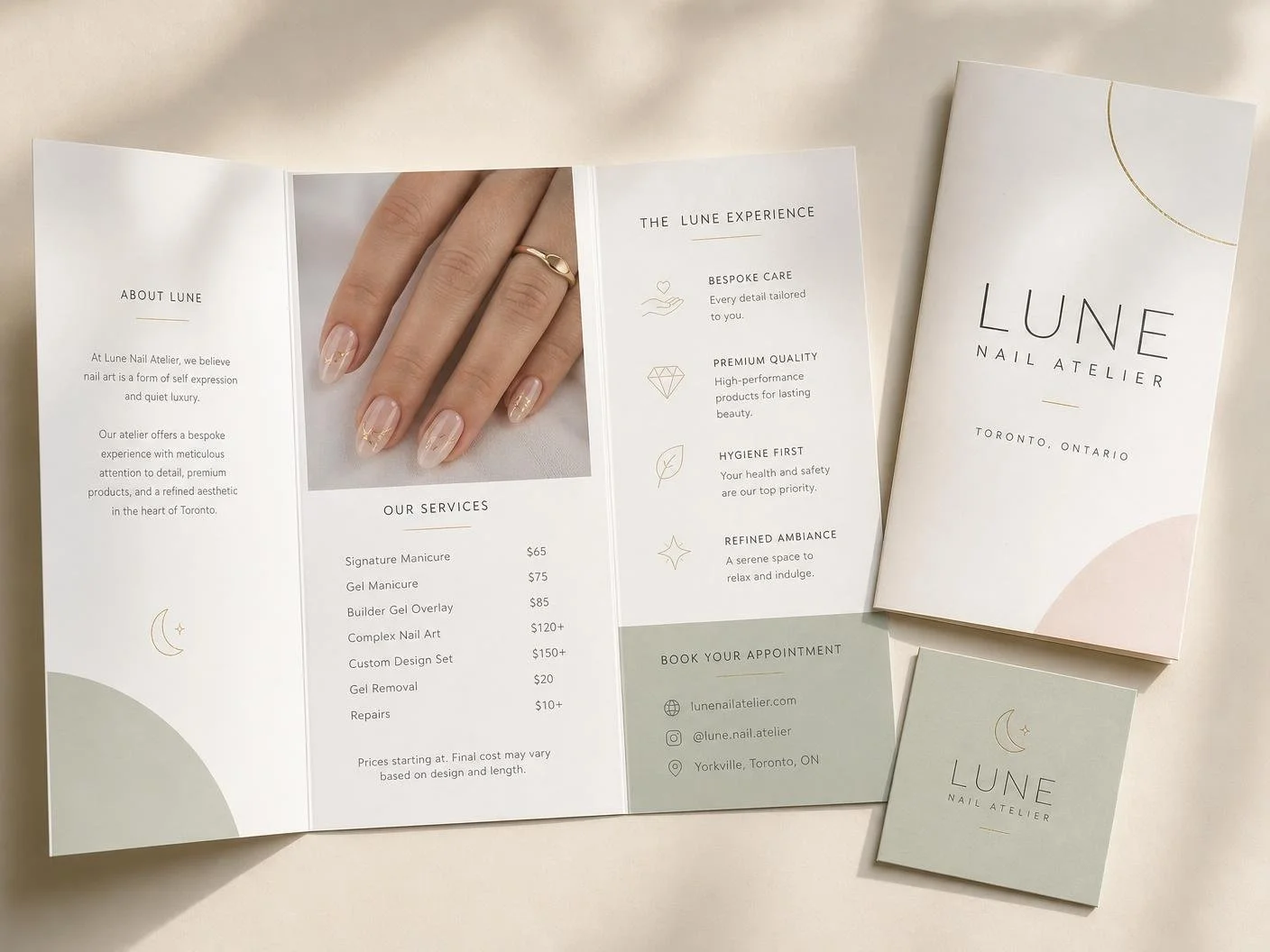
Tri-fold brochure, service menu, appointment card
Year
2026
Overview
Lune is a small Yorkville studio offering bespoke nail art. The brochure is handed to clients in-studio and mailed to partner salons, so it had to work as both a menu and a keepsake.
Nail art is visual, but a service menu is dense with numbers. The brief was to give the photography room to breathe without pushing the pricing into fine print.
Challenge
Each panel runs on a single-column grid with wide outer margins. One image panel, one service panel, one experience panel — nothing competes, and the fold order tells a simple story.
Panel one: brand story and studio positioning
Panel two: full-bleed nail photography and service pricing
Panel three: the Lune experience and booking details
Back cover: wordmark, crescent mark and contact block
Layout & Grid
Ivory stock carries the set, with soft blush and muted sage used as quarter-circle blocks rather than fills. Fine gold appears only as hairline rules and the crescent icon.
Colour Palette
Printing a folded dummy early caught a panel-width issue at the tuck fold. Shaving two millimetres off the inner panel made the brochure close flat and feel properly finished.
Lessons Learned
Next Project