

Brand Identity
Maple Crumbs Bakery
A complete identity for a small-batch Toronto bakery — a friendly wordmark, a maple leaf icon, and a warm packaging system that works from a business card to a storefront sign.
Brand identity
Discipline
Logo suite, packaging, stationery, signage
Deliverables
Year
2025
Brand Strategy
Maple Crumbs sits between a neighbourhood bakery and a modern café. The strategy positioned it as 'everyday craft': warm and familiar, but with the precision of a design-led brand.
References drew from kraft packaging, linen aprons, muted botanical prints, and Scandinavian bakery interiors. Warmth without nostalgia, minimal without coldness.
Moodboard
Three directions were explored: a monoline maple mark, a stacked serif wordmark, and a badge lockup. The stacked wordmark with a simplified maple leaf won for its flexibility at small sizes.
Primary stacked wordmark
Secondary horizontal lockup
Standalone maple leaf icon
Stamp variant for wax and packaging tape
Logo Exploration
Cream and kraft form the base so the food stays the hero. Maple brown carries the logo, and a soft sage accent keeps the palette from feeling too sweet.
Colour Palette
Final Brand Identity
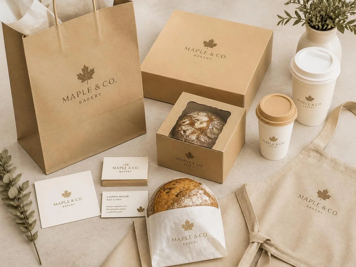
The finished identity ships as a compact guideline set: logo usage, colour values, type scale, and packaging templates the owner can hand directly to printers.
Next Project